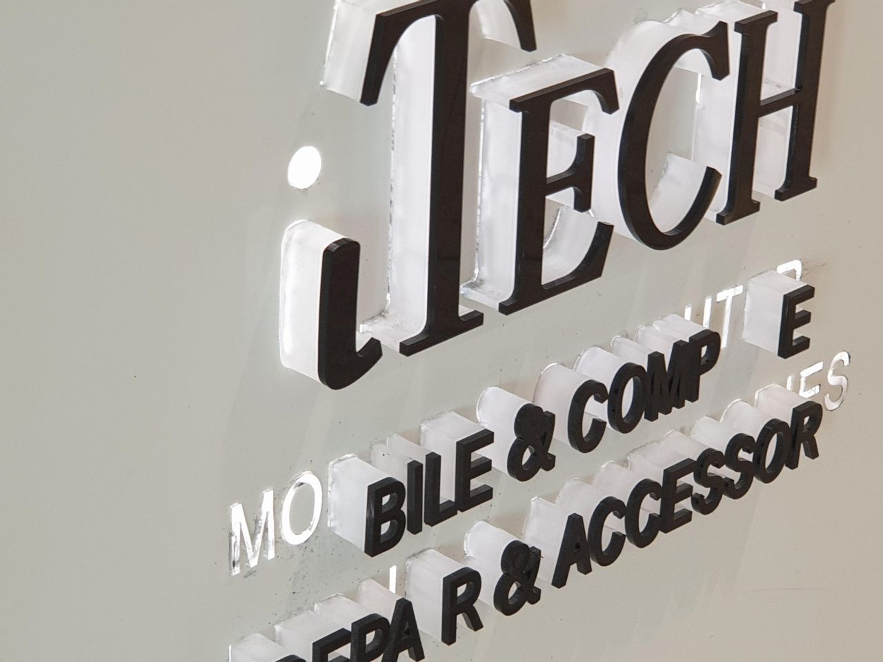
If you’re shop fitting a new store, or redoing an existing location, you’ll know the importance of well-planned signage. Of course, designing, manufacturing and installing signage for your business is an investment. And, if it doesn’t do the job right, that’s money down the drain.
That’s why hiring a reputable designer and sign manufacturer is key to ensuring your shop fitting project reflects the potential of your brand. Today, we’re sharing the top five signage design mistakes people make when shop fitting.
Here’s what you need to know.
1. The wrong specs
Knowing what specs work for your signage is vital to making sure your shop fitting project has the right effect. Managing Director of Sign Here Signs, Russell Friedman, shared an example with us.
“Too often designers spec 30mm or 20mm push through letters, while the stroke is maybe 10mm thick or less,” he said.
“As a result the light LED light can’t travel that far so the sign looks terrible.”
Having the right signage professionals on your team is the best way to avoid these kinds of errors.
“We can easily look at an existing design and pick up issues with how the lighting will look in real life,” Russell said.
“In many cases, this saves our clients significantly, and makes sure their store looks the way they want it to.”

2. The visibility of letters
The size of your letters matter a whole lot. Before choosing letters for your signage it’s important to measure where the sign will be placed, so the letters can sized relative to the space.
Forbes agrees with this general rule, and even supplied a Letter Visibility Chart to help shop fitters and other people looking to install signage, with choosing the right letters.
Letter Visibility Chart
| Viewing Distance | Minimum Letter Height Required |
|---|---|
| 30.5 metres | 10.16 cm |
| 76 metres | 25.4 cm |
| 110 metres (City block) | 40.64 cm |
| 152 metres | 55.88 cm |
| 229 metres | 83.82 cm |
| 305 metres | 109.22 cm |
| 402 metres | 144.78 cm |
Incorrectly sized letters are a waste of money, and in some cases, can be dangerous, if the signage is being relied on for safety instructions. A good sign maker will ensure letters are correctly sized, so the public can easily understand the information being conveyed.
3. Location matters. A lot
It may sound obvious, but where you put your signage matters. Let’s use Joe Blow as an example. Joe opens his new store in summer, complete with a custom made back lit LED sign, which everyone tells him looks really cool.
Then winter comes and the big tree out front grows its leaves. Joe’s really cool sign is now obscured. And the money and time he put into making it has been rendered pointless.
It may sound stupid to install a sign behind a tree, or somewhere else that obscures the message of the signage, but it’s surprisingly common. After all, Joe isn’t a signage installer, so these kinds of issues are not on his radar.
Having a signage professional review where you’d like your signage to be installed, before you start the shop fitting process, will save you time and money in the long term.
You’ll know from the outset the ideal positions for your signage, and can then plan your shop design around these important elements, or even incorporate the signage into the overall design of the shop.
Either way, your shop will look more aesthetically pleasing, and customers will have a more enjoyable experience of your space
Need quality signage for your shop fitting project?
Talk to us about your shop fitting requirements, and we can recommend a signage solution that aligns with your brand and the overall design of your shop. We’ll also make sure your signage looks great, and is as effective as possible.
So you don’t end up like Joe Blow.

