If you need signage for your business or an event there are a lot of things to consider if you’d like your new signage to look its best and stand out above the rest. Here is an article with some helpful tips.
Get in touch with us today and we will work with you to create the best solution for your location and budget.
Originally published in Business Matters
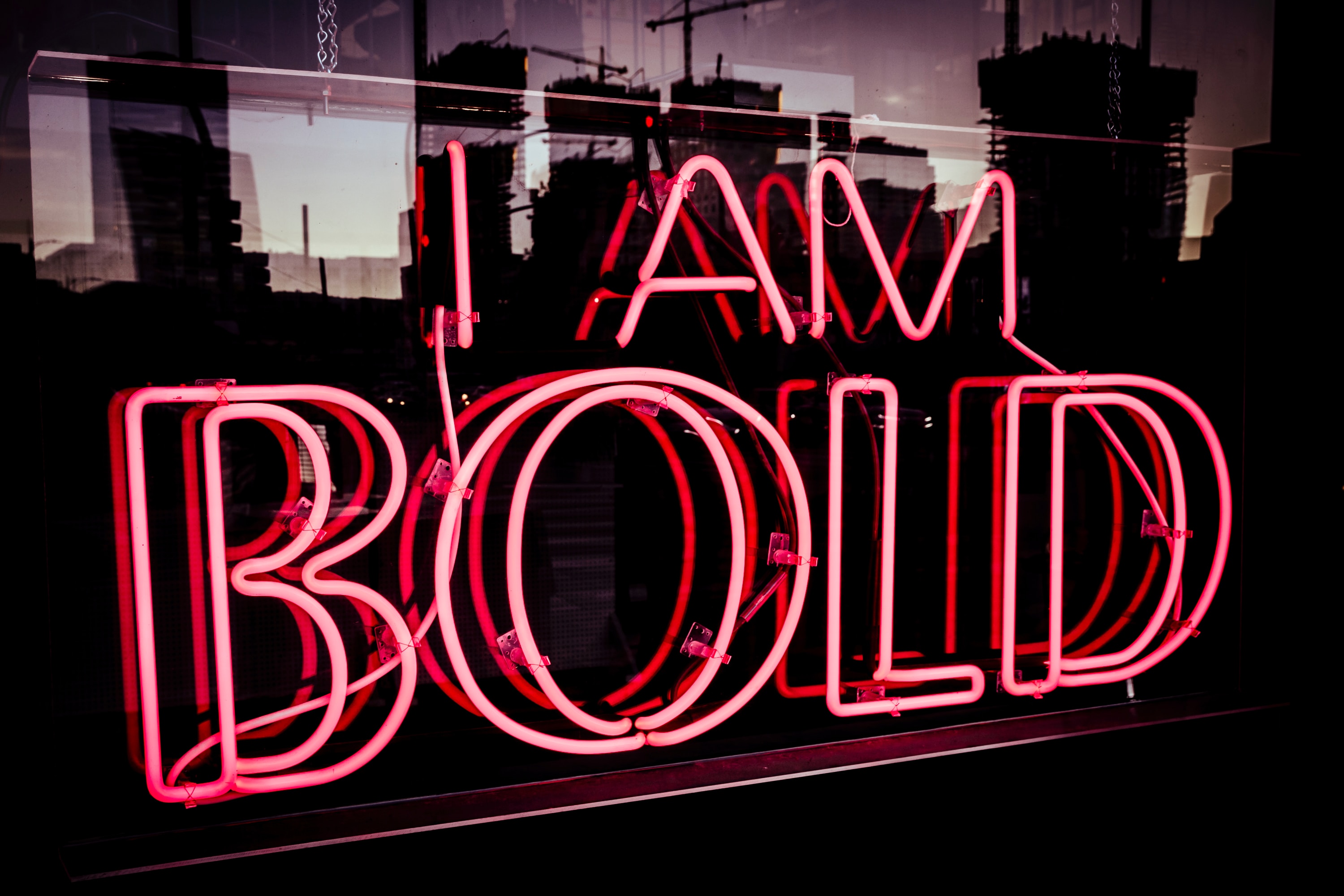
Photo by Steve Harvey on Unsplash
How to make your business sign stand out from the crowd
Business signage is essential if you have physical premises of any kind, whether you’re a high-end retailer with a luxury boutique in a busy town centre, or you’re a car garage operating on an industrial estate.
If your customers need to find you or see that you are present in their vicinity, signage is still the best way to attract their attention.
But it can be hard to stand out from the competition with so many innovative and interesting signs out there. This applies in equal measure to event and permanent signage. Many businesses co-locate and vie for visual attention with limited space. The same applies to exhibitions, events and with advertising space, where there is only so much room and just a limited amount of time to make that vital impact.
So how can you ensure that your business signage does stand out and give the right impression?
1. Know what your signage is for
A piece of permanent signage for a shop exterior will look different and have different messaging on it than temporary signage for an event or exhibition. Define your goals and don’t try to achieve too much with one piece. It’s great to have a suite of different pieces of signage, but plan them as a set so that you get maximum benefits and reusability.
For example, if you attend a lot of trade events then it may be worth investing in a large pop-up stand with a frame, carry case and changeable panels so that you can adjust your messaging and get great value from your investment. Different sign types include outdoor, informational, accessibility or persuasive (including point of sale for retailers.) Always set goals and objectives for each sign to ascertain their success.
2. Consider your budget
If you have money to invest in quality signage, then it can reap dividends over the longer-term. Aim to buy the best signage that you can for if it needs to occupy a permanent space or have a high-quality impact. Temporary signs for events or exhibitions can be disposable – or use digital signage so that you aren’t wasting materials or your budget. The better your signage, the more it will stand out.
3. Get your brand in place
If you don’t already have a brand or logo, now is the time to develop one. Work with a graphic designer with a background in branding and communicate your business purpose, objectives and values. Define your target audience and your typical customer. Input with any other information that you can provide, such as other brands that you like by way of example.
The designer will help to create a logo that stands out and which appeals to your audience. This can then be replicated across your signage to great effect. Remember that signs are visual in nature and a great logo will instantly provide that ‘wow’ factor.
4. Prepare your messaging
With so many signs to look at, customers need to be engaged with clear, simple and ready messaging. Use a headline, an explanatory sentence and any key bullet points underneath. Minimise words as far as possible and don’t clutter your sign with unnecessary extras. Use a readable font and avoid scripts. Make the call to action clear and succinct if the sign needs to stimulate a response.
5. Design for readability
Your signage must be read from a distance and by people who are passing; not all of whom will have great eyesight. So choose colours with a contrast, such as a black typeface on a pale background. This is known as light reflectancy and it helps to know what colours stand out against others.
Don’t clutter the signage with badly contrasting colours either, as it’s one thing for your sign to be unreadable from a distance but you don’t want it to be garish and ugly either. The choice of colour palette will depend on the image and personality of your business. Your designer can use colour theory to create the right look and feel, which will resonate with your target market. For example, red denotes passion and energy, whilst yellow is intellectual and optimistic.
6. Test your sign
Before you send your signage graphics to print, test them with a small audience of customers. Get your printer to the site to measure up and check accessibility and H&S considerations (including lighting) for permanent signage. Check the detail to avoid any costly errors or reprints.
7. Evaluate
You’ll soon know if your sign is outperforming the competition with an upswing in footfall to your business or increased volumes in your intended call to action. Review, evaluate and look for ways in which to improve your signage in future, aiming to constantly better your efforts to stay ahead of the game.


