Most business owners understand the power of good signage. Use it wisely, and you’ll maximise foot and drive by traffic, boost recognition of your brand and create a first impression that, well, impresses.
As professional signage geeks who design, craft and install signs for a living, we hate to see poorly thought out signage in the wild. In an effort to curb it, we’ve decided to share our top 5 pet peeves, so you can make smarter signage choices that boost your bottom line.
1. Poor Location
Yep, the old real estate adage applies to signage too. But, before you even think about where your signage should be placed, consider its purpose first.
If the sign is supposed to show people where your business is located, it will need to be visible from the road, so clients can easily identify your business and find you.
If your outdoor signage is easily seen from the road, or even on trains and walkways, you’ll maximise visibility to the public. In order to do this effectively, consider:
- Whether your sign could be obscured by plants, trees or other structures. This is especially important when positioning signage in new developments, where foliage is not fully grown or other structures have not been built. Request plans to find out whether anything could compromise the visibility of your sign in the future.
- The size and design of your sign. Placing too much information on a sign designed for passers-by will make it harder for people to read it, especially if they’re driving past and only have seconds to absorb it. Use a good designer, who understands the impact of effective signage design, so your message is clear and ‘on brand’.
- Use a signage super hero. Okay, *ahem* we’re putting our hand up on this one. We have designed and installed signs for businesses all over WA, and know exactly how to position a sign for maximum exposure, so you in turn maximise return on investment on your signage.

Source: Don Colin Photographs
2. No sun sense
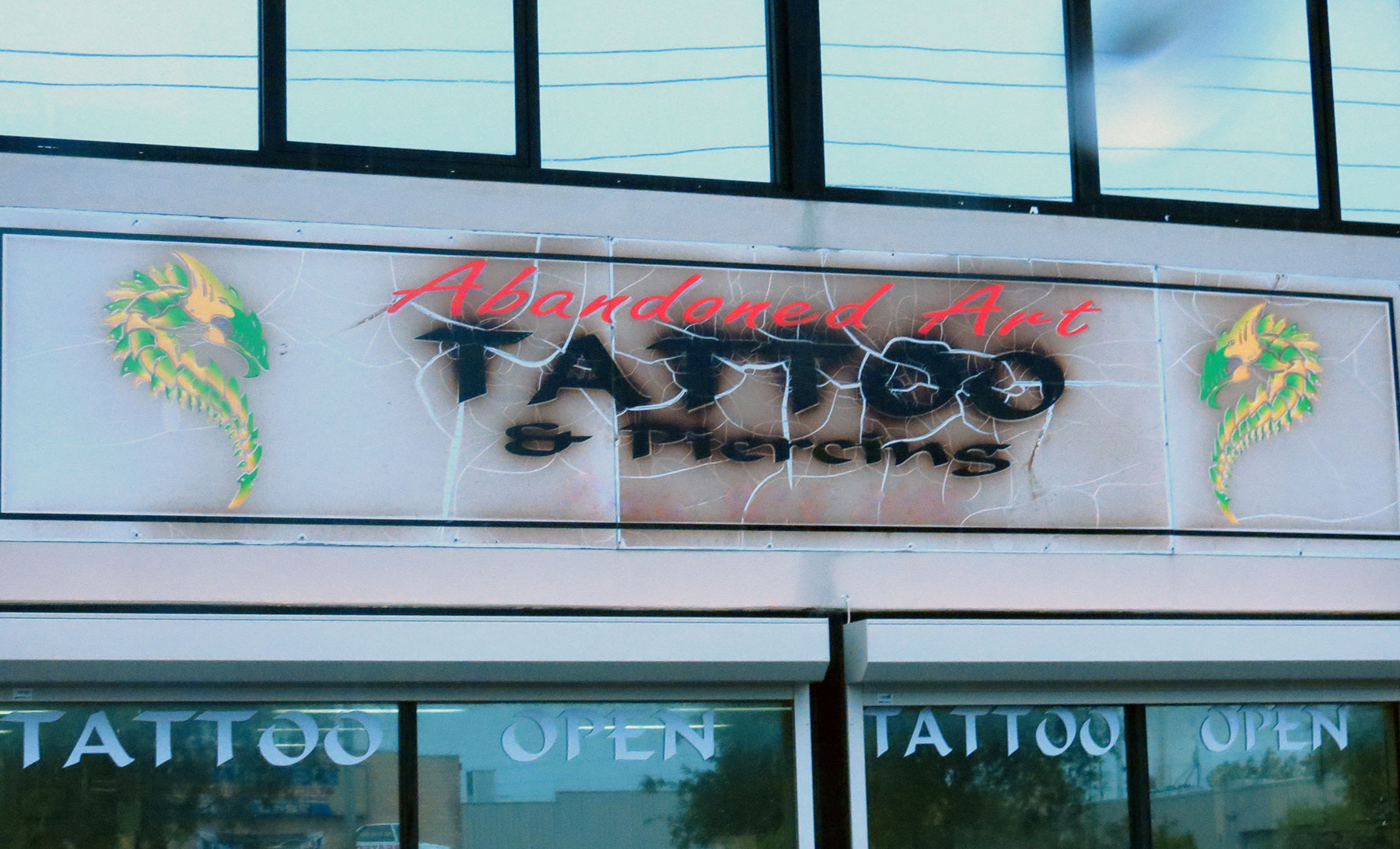
Okay, technically signs don’t need a hat and sunscreen, but, they do need protection from UV rays. Without some kind of sun protection, your sign will fade quickly, especially in the harsh WA sunshine.
We use quality UV inks and protective coatings to maximise the longevity of your signage. That way, you don’t have to see us any time soon, and you also get a durable, good looking sign that makes your business look as good as it is.
3. Shoddy design
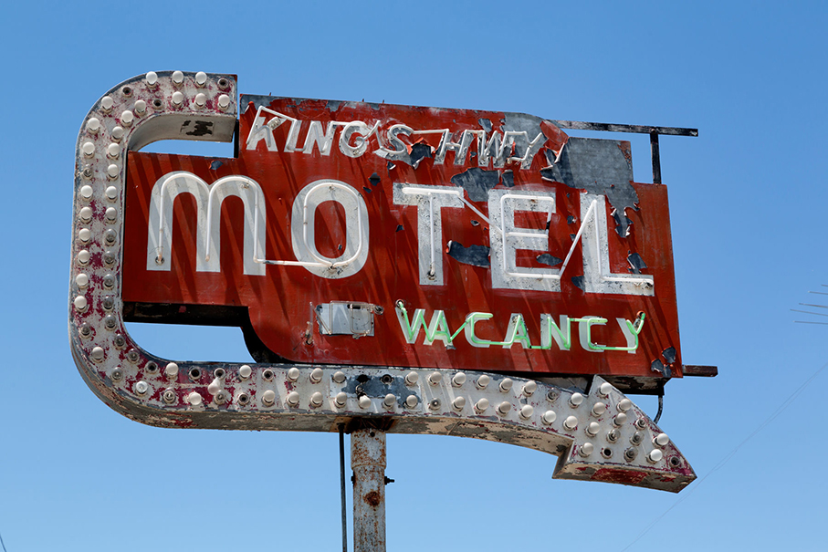
So often we see businesses pay big bucks for a top of the range sign, but then skimp on the design. A good sign should reflect your business in all its glory. It should shout who you are, what your values are, and what kind of service you provide.
This doesn’t mean cluttering signage with words. Rather, consider using imagery, key words and clear brand messaging to convey a professional and eye catching piece of advertising collateral. Spending a little extra on a good design is well worth it.
Source: Visual Technology Signs
Source: Nick and Lee
4. Graffiti
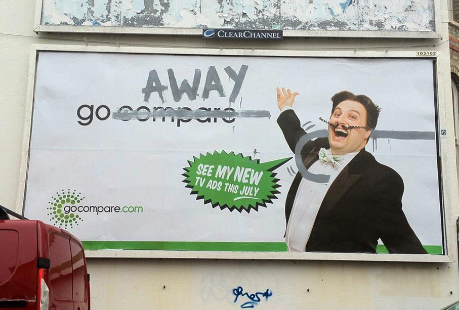
Folk who tag our signage with spray paint keep us up at night. After all, we put a lot of thought and effort into our signage, and want it to look good for years to come. Baz woz here, shouldn’t be able to ruin that in a second.
We install signs with a protective film that makes cleaning off graffiti much easier. We can also position and install signage to minimise theft, just in case someone thinks your business signage would look good in their lounge room.
5. Not using a pro
We could probably write an entire thesis on the do’s and don’ts of effective signage, but we know you’re running a business and living your life, so we won’t put you through that. But if you do need quality signage that turns heads, and lasts, please get in touch.
We have been designing, fabricating and installing signs in WA and Australia-wide since 1992, and we’re happy to share our expertise with you.

